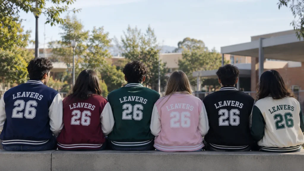
Best Colour Palettes for Leavers Jackets by School Theme
The best leavers jacket colours are the ones that reflect your school’s identity, house colours, mascot, or year theme paired with a high-contrast accent (like navy & gold or maroon & white) so the design pops in both photos and real life.
Choosing a colour isn’t just a design step, it’s the decision that ends up defining how your entire year group remembers this jacket. Get it right, and it becomes the thing everyone still wears years later. Get it wrong, and it’s the thing tucked in the back of a wardrobe by September. The good news: once you know your school’s “theme,” the right leavers jacket colour palette becomes a lot easier to land on.
Here’s a theme-by-theme breakdown to help your group agree faster and avoid the classic 40-person group chat argument over “navy or black.”
1. House Colours Theme
If your school runs a house system, this is often the easiest starting point — the colours already exist, and everyone already has an emotional attachment to them. The trick is choosing a neutral base colour for the jacket, with house-colour accents for text and detailing.
Palette suggestions:
- Deep red base with white lettering
- Forest green base with gold trim
- Royal blue base with silver print
2. Movie & TV Theme
For year groups that go all-in on a shared theme — Harry Potter, superheroes, a favourite Netflix series — colour choice becomes about capturing the feel of the theme rather than copying it exactly (important for staying original and avoiding licensing issues). A custom leavers jacket inspired by a magical-school aesthetic might lean into deep maroon and antique gold, while a superhero-inspired design often works best with bold primary colours against black.
Palette suggestions:
- Maroon and antique gold (fantasy/magic feel)
- Black base with a single bold accent colour (hero-inspired)
- Deep purple with silver detailing (mystery/adventure feel)
3. Decade Theme (90s, Y2K, Retro)
Nostalgia-themed leaving years are having a real moment, and colour is where this theme lives or dies. Retro palettes tend to favour contrast and boldness over subtlety — pastel pink with black, or bright orange with cream, both read as instantly “retro” without needing extra graphics to explain it.
Palette suggestions:
- Pastel pink base with black print
- Mustard yellow with cream detailing
- Sky blue with white retro-style lettering
4. Nature & Animal Theme
Schools with a mascot or nature-inspired identity think eagles, wolves, oak trees tend to look best in colours pulled directly from the natural world rather than bright, artificial tones. Earthy palettes photograph well outdoors and tend to age better than trend-driven colours.
Palette suggestions:
- Forest green with brown or tan accents
- Slate grey with deep navy detailing
- Burnt orange with charcoal print
For ideas on fabric options that work well with these earthy colour palettes, read Best Fabrics for Bulk School Leavers Jackets in Australia.
5. Minimalist & Modern Theme
Not every year group wants bold graphics, some prefer a cleaner, more grown-up look they’ll actually wear beyond school. For this theme, less genuinely is more: one base colour, one accent, and simple typography instead of busy prints.
Palette suggestions:
- All-black with white minimal text
- Cream base with black serif lettering
- Sage green with subtle tonal print
Mixing Themes: When Your Year Group Can't Agree on Just One
Not every year a group fits neatly into a single theme, and that’s fine. A common solution is to pick one “anchor” colour that everyone agrees on, often a school colour and let the second theme show up in smaller details like inner lining, zip pulls, or back-print artwork. This way, a group split between a retro theme and house colours doesn’t have to choose one over the other; the jacket base carries the school identity, while the accents carry the personality.
Testing Your Palette Before Committing
Before locking in a final colour combination, it’s worth mocking it up digitally and viewing it at actual jacket scale rather than as a small thumbnail on a phone screen. Colours that look great in a tiny preview can feel completely different across a full jacket back, especially with metallic or glitter-effect prints. Most reputable suppliers will provide a digital proof before production, always ask for one, and view it on more than one device if possible, since screen colour calibration varies.
How to Actually Agree on a Colour as a Group
The fastest way to kill a colour debate is to stop asking “what colour do you like” and start asking “what colour represents us.” Run a quick poll with three curated options (not an open-ended free-for-all) based on your school’s actual theme, house colours, or mascot. Groups that narrow choices down before voting tend to land on a final leavers jacket design in days rather than weeks which also protects your ordering timeline.
Colour Psychology, Briefly
It’s worth knowing that colour choice does more than look good — it sets a tone. Navy and black read as classic and timeless. Bright colours like orange or yellow read as fun and energetic. Pastels lean nostalgic and soft. There’s no wrong answer, but knowing what mood you’re going for makes picking the palette much faster.
Conclusion
The best leavers jacket colours are ultimately the ones that feel unmistakably yours tied to your school’s identity, your year group’s personality, or a theme you’ve all bought into together. Whichever direction you choose, Ekwear offers a wide range of colourways and finishing options, so once your group agrees on a palette, bringing it to life on a real jacket is the easy part.
Frequently Asked Questions.
1. How do I choose colours that suit everyone in my year group?
Base your palette on something shared — house colours, a mascot, or a theme — then run a short poll with 2–3 curated options rather than leaving it fully open-ended.
2. Can I mix more than two colours in a leavers jacket?
Yes, but two to three colours (one base, one or two accents) usually gives the cleanest, most wearable result. More than that can make text and prints harder to read.
3. What are the most popular leavers jacket colours?
Navy, black, and maroon remain the most popular base colours because they photograph well, and pair easily with almost any accent colour.
4. Do dark or light jackets look better with prints?
Dark jackets tend to make bold prints and metallic text stand out more, while light jackets suit softer, pastel-style designs. Both work — it depends on your theme.
5. Can I match my leavers jacket to my school badge colours?
Absolutely — using your school badge or crest colours is one of the most popular and recognisable approaches, especially for house-colour or heritage-themed designs.