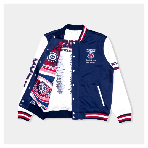
Custom Leavers Jacket Fonts: Find Your Perfect Lettering Style
Getting your leavers jacket right is a big deal. It’s one of those things you’ll pull out of the wardrobe years from now and immediately be transported back to the laughs, the late nights, the people who made Year 12 what it was. These jackets aren’t just clothing; they’re a snapshot of a chapter in your life.
Leavers varsity jackets have become a proper tradition across Australia, and for good reason. But once you start designing, picking your nickname, adding your graduation year, figuring out what goes where you’ll quickly realise that the font you choose can make or break the whole look. Get it right, and your jacket looks sharp and personal. Get it wrong, and it can feel a bit off.
So let’s break down what actually works.
Why Your Font Choice Matters More Than You Think
It might sound like a small detail, but typography does a lot of heavy lifting on a leavers jacket.
Your name or nickname is usually the centrepiece sitting right there on the back for everyone to see. That means it needs to be readable from across the room, not just up close. Fonts that look beautiful on a screen can turn into a blurry mess once they’re embroidered onto thick jacket fabric. Thin strokes, delicate flourishes, overly complex lettering they all tend to fall apart in the real world.
Beyond readability, your font says something about you. Are you going for a classic, traditional look? Something bold and modern? A bit artsy and individual? The right lettering style can say all of that without a single extra word. Check out our online designer tool.
The Main Font Styles and Where They Shine
Classic Varsity Fonts
These are the staple for a reason. Bold, clean, and instantly recognisable, varsity fonts have that timeless quality that never really goes out of style. They look great embroidered, hold up at a distance, and carry that sense of school pride without trying too hard.
Best for school initials on the chest, graduation year on the sleeves, surnames across the back.
Script Fonts
If you want something a little softer and more personal, script fonts can be a great option especially for first names or nicknames. They’ve got an elegant, handwritten feel that adds a touch of personality to the design.
Just be careful here. If the script is too thin or too intricate, it won’t translate well to embroidery. Stick to bolder script styles that keep their shape when stitched.
Graffiti and Artistic Lettering
Want something that really stands out? Graffiti-style fonts are bold, expressive, and full of character. They work best on the back panel where there’s enough space to let the design breathe. If you’ve got a nickname that’s a bit larger than life, this kind of lettering can suit it perfectly.
Minimalist / Sans-Serif Fonts
Not everyone wants to go all-out. Clean, simple fonts give a jacket a sleek, modern feel understated but still polished. If you’re someone who prefers things neat and unfussy, a good sans-serif can look genuinely sharp.
Retro Fonts
There’s been a big resurgence of retro styling in streetwear, and it translates really well onto leavers jackets. Think rounded edges, bold curves, and that unmistakable 70s and 80s energy. It’s a fun, nostalgic choice that still feels fresh.
Bold Block Lettering
Simple, strong, and impossible to miss. Block fonts are a solid choice if you want your name to dominate the back of the jacket. They embroider beautifully and have a satisfying visual weight to them.
Putting It All Together
Choosing a font is just one piece of the puzzle. Here are a few things worth thinking about as you pull your design together:
Colours matter as much as fonts.
High contrast tends to look best, think white lettering on a navy leavers jacket, gold embroidery on black, or cream on maroon. The sharper the contrast, the more your text will pop.
Placement shapes the whole design.
A good rule of thumb: keep smaller, cleaner elements on the chest (school initials, a small logo), save the back for your bigger, bolder statement, and use the sleeves for things like your graduation year or school mascot.
Don't overcrowd the design.
One or two complementary fonts is usually enough. Mixing too many styles at once can make everything compete for attention and nothing wins.
A Few Mistakes to Avoid
- Choosing fonts that are too thin or too detailed they lose their shape once embroidered
- Using too many different styles it starts to look cluttered rather than creative
- Not thinking about how the font will look at scale what works small on screen can look very different blown up across a jacket back
What's Trending Right Now
If you’re after some inspiration, here’s what a lot of students are going for:
- Varsity fonts with outlined embroidery for extra depth
- Script nicknames paired with block-style surnames
- 3D embroidered lettering for a premium finish
- Custom artwork or illustrations on the back panel
These combinations hit a nice balance between classic and personal. They feel current without chasing trends so hard that they’ll look dated in five years.
Final Thought
Your leavers jacket should feel like you are not just a generic template with your name slapped on it. Take the time to think about what fonts, colours, and placement actually reflect your personality and your year group. The best jackets strike that balance between school pride and individual character, and the lettering is usually where that balance is either made or lost.
Have fun with the EKwear’s design process. It’s one of the few times you get to put something genuinely personal on something you’ll keep forever.
Frequently Asked Questions
1. What's the most popular font style for Year 12 jackets?
Bold varsity fonts are consistently the most popular — they’re traditional, readable, and look great embroidered.
2. Can I mix fonts on my jacket?
Absolutely, just keep it to two complementary styles for a clean result.
3. Where should my nickname go?
The back panel is the standard placement; it’s the most visible spot and gives you the most space to work with.
4. What jacket styles are most common in Australia?
Varsity jackets and zip-up styles are both popular and work well for embroidered lettering.
5. Where can I find design inspiration?
Look at what previous year groups have done, or browse the EK Wear online design tool to experiment with different combinations.